The Italian Design Principle That Changed How We Build Websites
The Word You Have Never Heard
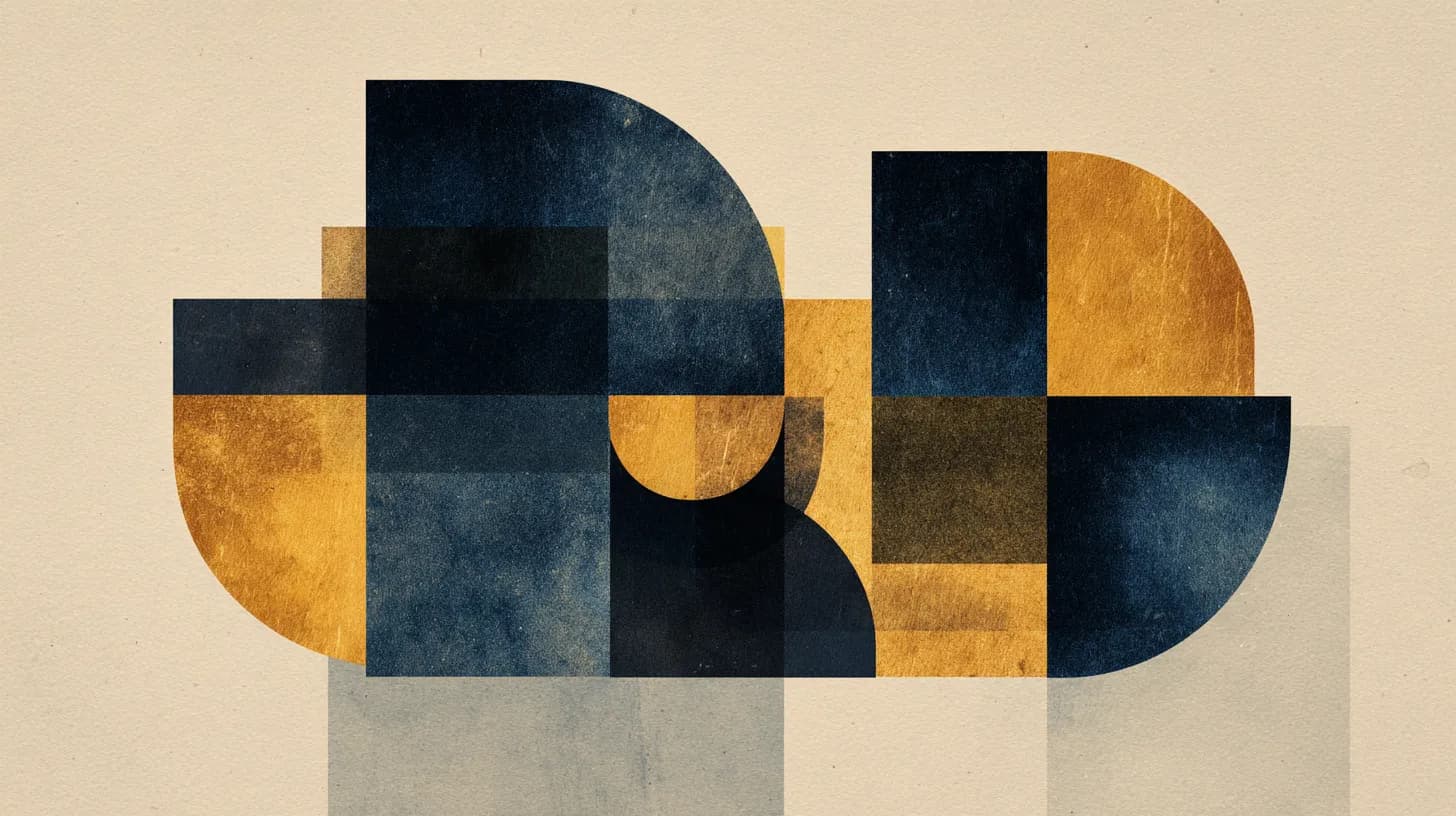
There is a word in Italian that has no direct English translation: sprezzatura. Coined by Baldassare Castiglione in 1528, it describes a studied carelessness — the art of making the difficult look effortless.
It is the principle behind every great Italian design, from Vignelli's subway maps to Pininfarina's sports cars. And it is the single most important concept we apply to web development.
From Vignelli to the Viewport
Massimo Vignelli believed that design is not about decoration. It is about clarity. His New York subway map stripped away geographic accuracy in favor of cognitive simplicity. People did not need a map of the city — they needed a map of the system.
This philosophy translates directly to digital interfaces:
When we design a website, we are not decorating a page. We are building a system for understanding. The Italian tradition teaches us that the best systems are the ones that feel invisible.
The Viva Partnership
Our collaboration with Viva, a Milan-based design studio, is not an outsourcing arrangement. It is a creative dialogue. Their team brings a design heritage that is rooted in centuries of Italian craftsmanship — the same lineage that produced everything from Renaissance typography to modern industrial design.
What this means in practice:
Three Principles We Apply to Every Build
Sprezzatura: Hide the Complexity
The most technically complex features should feel the simplest to use. A booking system that handles availability, pricing, and confirmation across time zones should feel like pressing a single button. The engineering effort is real. The user should never feel it.
La Bella Figura: Every Pixel Matters
In Italian culture, la bella figura means presenting yourself at your best in every context. Applied to web design, this means that every state of your application — loading, empty, error, success — deserves the same design attention as the hero section. No placeholder text. No unstyled fallbacks. No forgotten edge cases.
Funzionalita: Beauty Serves Function
Italian design has never been about ornament for its own sake. A Ferrari is beautiful because its form is optimized for performance. A Brionvega television is beautiful because its geometry solves a spatial problem.
On the web, this means animations should communicate state changes, not just look impressive. Typography choices should improve readability, not just express brand personality. Every visual decision should have a functional justification.
Why Design Heritage Matters in a Template World
The web is drowning in sameness. Template marketplaces and UI kits have made it trivially easy to launch a site that looks like every other site. The visual language of the internet has been flattened into a narrow band of safe, familiar patterns.
This is precisely why design heritage matters. A team that can draw on centuries of typographic tradition, spatial reasoning, and material craft will produce work that a template cannot replicate. Not because they ignore modern conventions — but because they understand why those conventions exist and when to break them.
The difference between a good website and a great one is not in the technology. It is in the decisions that no framework can automate: which typeface conveys authority without coldness, how much space a headline needs to breathe, where the eye should land first and where it should travel next.
The Compound Effect
When you combine Italian design sensibility with AI-powered development speed, something interesting happens. The time that AI saves on implementation can be reinvested in design refinement. Instead of shipping a first draft because the budget ran out, you ship a third or fourth iteration — the one where every detail has been considered.
This is the Roar Creative model. Speed without sacrifice. Engineering precision with design heritage. American efficiency with Italian elegance.
Ready for liftoff?
Start your mission→